Here is a post I wrote last month Employment: A comment on the Birth/Death Model. The key point is that the Birth/Death model minimizes the primary sampling error due to employment growth generated by new business formations. The model does miss turning points, but the BLS is now updating the estimation quarterly, and this should minimize the errors.
 Second, the graph server took the surge in traffic this morning as an "attack". This unfortunately caused some errors when clicking on the graphs for larger images (many readers just saw text). I apologize for the inconvenience.
Here is a repeat of the offending graph. If you click on the graph, the graph gallery should open with all of the employment related graphs (the tabs at the top of the gallery are for other topics: housing, house prices, manufacturing, etc.)
Here are a few more graphs based on the employment report ...
 This graph shows the duration of unemployment as a percent of the civilian labor force. The graph shows the number of unemployed in four categories: less than 5 week, 6 to 14 weeks, 15 to 26 weeks, and 27 weeks or more.
In general, all four categories are trending down, although the "27 weeks and over" category increased sharply this month.
Note that the "less than 5 weeks" used to be much higher, even during periods of strong job growth. This is probably because of a change in hiring practices that resulted in less turnover.
 This graph shows the unemployment rate by four levels of education (all groups are 25 years and older).
Unfortunately this data only goes back to 1992 and only includes one previous recession (the stock / tech bust in 2001). Clearly education matters with regards to the unemployment rate - and it appears all four groups are generally trending down, although only "High School Graduates, No College, 25 yrs. & over" decreased in May.
Although education matters for the unemployment rate, it doesn't appear to matter as far as finding new employment (all four categories are only gradually declining).
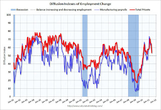
 This is a little more technical. The BLS diffusion index for total private employment was at 53.6 in May, and for manufacturing, the diffusion index decreased to 54.9.
 Think of this as a measure of how widespread job gains are across industries. The further from 50 (above or below), the more widespread the job losses or gains reported by the BLS. From the BLS:
Figures are the percent of industries with employment increasing plus one-half of the industries with unchanged employment, where 50 percent indicates an equal balance between industries with increasing and decreasing employment.The decline in both indexes was another negative in the May employment report.
Best to all
Here are the earlier employment posts (with graphs):
? May Employment Report: 54,000 Jobs, 9.1% Unemployment Rate
? Employment Summary, Part Time Workers, and Unemployed over 26 Weeks
? Employment graph gallery
Jamie Gunns Ananda Lewis Kate Bosworth Tamala Jones Yamila Diaz
No comments:
Post a Comment